A tour of Luum
Six screens, in the order you would meet them. The point is the shape of the answers, not the numbers.
Everything you hold, in one place
A TFSA at one brokerage, an RRSP at another, a taxable account somewhere else. Luum reads them all (read-only, through your institution’s own login), converts them to one currency, and shows the combined picture. It looks through your ETFs to the companies inside them, so two funds holding the same names cannot hide a concentration.
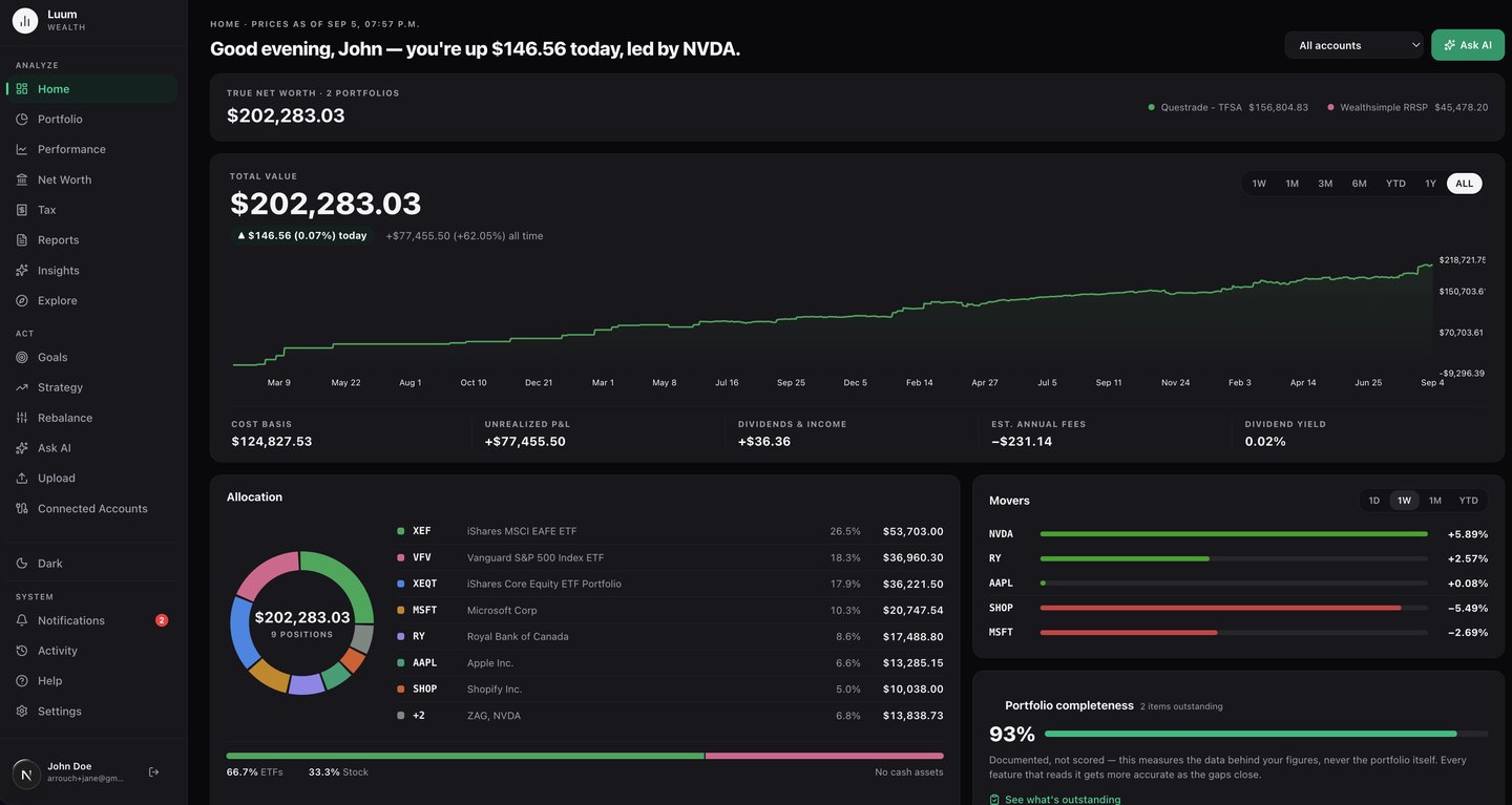
What to look at: The account picker reads “All accounts”: the value chart, allocation and income below it are the blend of several brokerages, not one.
What you actually own, once you look inside the funds
Two index funds can hold the same companies without either statement saying so, and a position you think is small can be the largest thing you own. X-ray resolves every fund you hold to the securities inside it, combines that with what you hold directly, and counts how many separate ways you own each name. It is the screen most people find something they did not know was there.
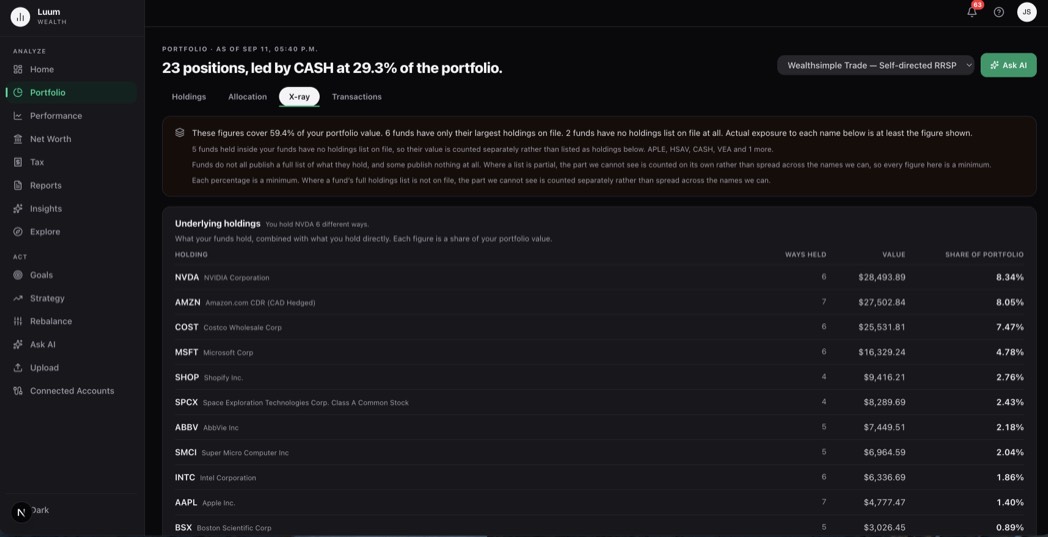
What to look at: The banner before the table says what it cannot see. Some funds publish only their largest holdings and some publish none at all, so the unseen part is counted on its own rather than spread across the names we can see, and every figure below is a floor rather than a precise number. A tool that reported a confident figure here would be reporting one it does not have.
Whether it is actually working
Most tools compare your percentage return to an index’s, which flatters you when you have been adding money into a rising market. Luum buys the comparison with your real contributions on the dates you made them: against an index, the risk-free rate, or the region targets on your own Goals page. Sometimes the answer is that you would have done better leaving it alone.

What to look at: The headline states the finding rather than burying it, and here the finding is unflattering: this portfolio is $5,840.06 behind the index on the same contributions.
How far you have drifted from your plan
You set targets by asset class, region and sector. Luum tracks the gap between that plan and what you actually hold, flags the position that quietly grew past your comfort level, and computes the what-if trades that would close it. You place any trades yourself, at your brokerage. Luum has no order path, by design.
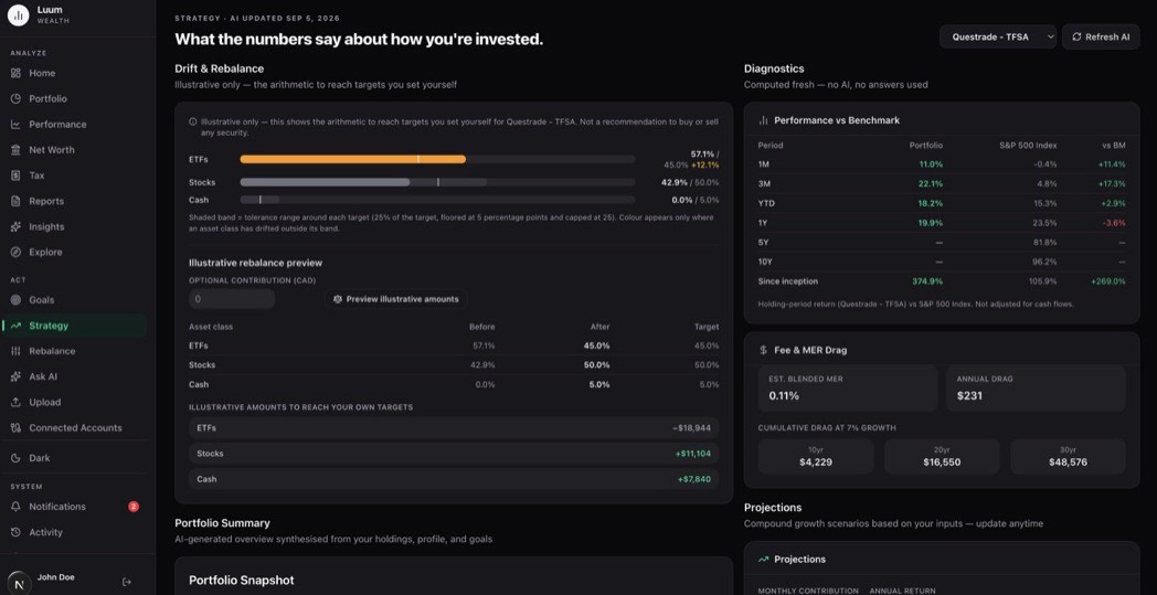
What to look at: The shaded band behind each row is the tolerance range around that target. Colour appears only where an asset class has drifted outside its own band.
Every trade, in the currency it happened in
Allocation and drift can be built from a snapshot of what you hold today. A cost base cannot: it is assembled from the purchases behind each position, and a US-listed holding converts at the rate on each purchase date rather than once at the end. So the ledger keeps every transaction as it happened, filterable down to dividends, deposits or fees, and exportable in full.
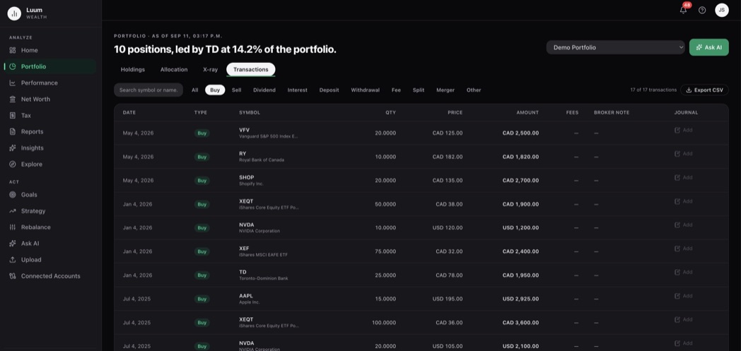
What to look at: The Canadian-dollar and US-dollar trades sit in the same table in their own currency. Flattening them to one number at today’s rate is where a spreadsheet cost base goes wrong first.
The record your spreadsheet stopped keeping
Adjusted cost base is the number a sheet gets wrong first: pooled across accounts, through years of partial sales, with a rate attached to each transaction rather than one applied at the end. Luum computes it on the average-cost method and exports the result for you or your accountant. It computes and exports; it never files anything.
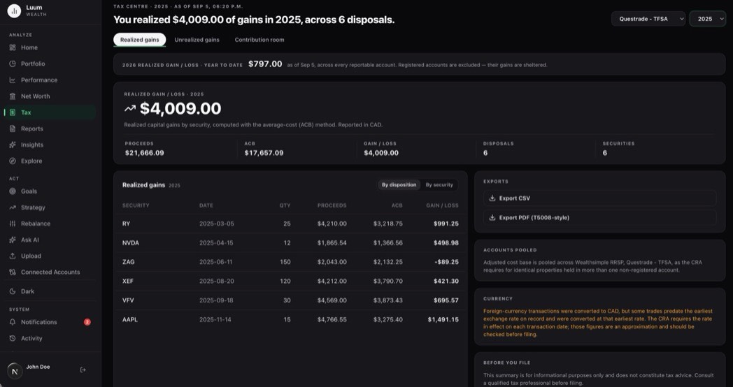
What to look at: Cost basis is pooled across accounts, because the CRA treats identical property as one pool no matter how many accounts it sits in.
What the tour does not show
Luum cannot place a trade, move cash, or change a setting at your brokerage, because connections are read-only by construction. It does not file anything with the CRA, and it is not a recommendation to buy or sell anything. What Luum is and isn’t sets out the edges in full.
Starter is free forever. No credit card required.